For the first time in more than 15 years, Elon University is rebranding, updating its signature, wordmark and the Phoenix logo for athletics.
There are two major additions: a monogram “E” and a leaf shield to go with the signature.
The monogram “E” was built with other major universities in mind, including Duke University, Wake Forest University and the University of North Carolina at Chapel Hill.
Each of those schools has a logo of the main letters for each: a blue “D” for Duke, a gold “WF” for Wake Forest and a blue “NC” for UNC-Chapel Hill.
Now, add Elon’s maroon and gold “E.”
“Those are the best in small formats,” said Dan Anderson, vice president for University Communications. “So we decided, if we adopted an E, it would really work well in small formats. And we can use it institution-wide.”
Only two of the eight Division I schools to begin with the letter “E” use a monogram “E” as their main logo. Anderson said Elon can become the main school identified with the letter.
“It’s a real market opportunity for us,” he said.
He identified three main areas the addition of the “E” wanted to cover, with the biggest one concerning the difficulty to see the Phoenix logo in small formats.
“When you’re on a mobile device and you have a little scoreboard thing, like on ESPN, you can’t tell what it is,” Anderson said. “If it’s on a score-bug on a broadcast, you can’t really tell what the thing is.”
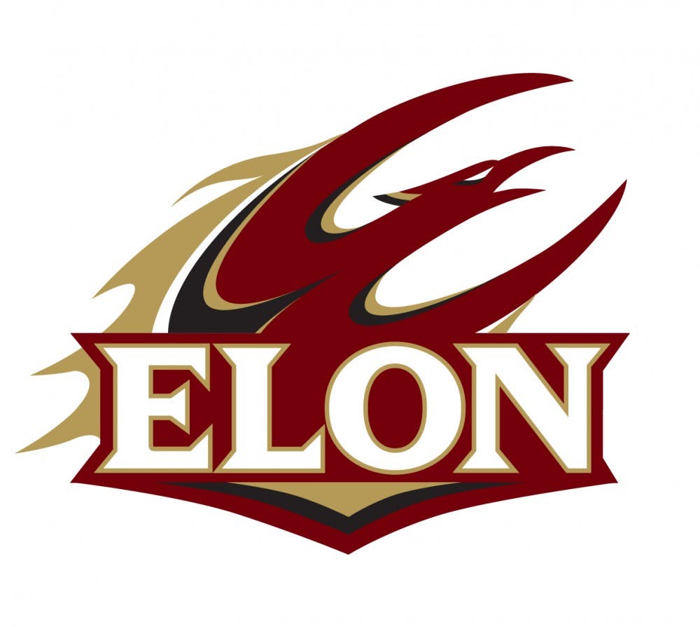
The new primary mark adds “Elon” to the bottom of the Phoenix, which helps identify the school with the phoenix bird. Anderson said people wouldn’t know what school the bird was supposed to represent without the school’s name.
The bird is shaped to look like the letter “E,” and theoretically can replace the “E” in Elon, like it does on the top of Rhodes Stadium’s press box.
“A lot of people didn’t get that,” Anderson said. “It didn’t really work well.”
The change ties the name to the logo for athletics’ primary mark, and there are even other versions with Phoenix or a specific sport beneath the logo — in fact, the golf team’s current van has the new logo with “Elon Golf” on it.
“We’ve been using the Phoenix mark for almost 16 years now,” said Dan Wyar, director of communications for athletics. “We felt it was time to make some tweaks to that.”
The phoenix bird can still stand alone, separate from the “Elon” script, but it is now just a secondary logo. Anderson said that version will mostly be used for internal audiences that already identify and know of Elon’s brand.
Elon is also replacing its current font set, which was custom-made for the university when it changed from the Fighting Christians to the Phoenix in 2000. Wyar said the Phoenix font gave the school unique challenges online, on apparel and on athletic fields.
“It really was time to upgrade it,” Anderson said. “It was very difficult to reproduce, and it’s got these three layers to it. It didn’t really work very well.”
The new font is called Tautz, and is the same for the athletic logo as it is with the monogram “E.”
There are some changes to the bird, which Anderson called an “evolution,” saying the bird has too much brand identity to change drastically. The changes are rather subtle, though.
They include the flames, which now touch the bird’s body and don’t break apart in the middle. The chin is also gone in an attempt to make the logo more recognizable as a bird, with the beak becoming more pronounced.
“Some feedback we got for the first time thought [the old bird] was a reptile or a lizard,” Anderson said. “So we did some minor modifications to the head to make it a little more bird-like.”
Overall, the athletic department feels like the changes to the set will receive positive feedback.
“We think we came away with something our fans are going to like,” Wyar said. “We’re excited to roll all of this out.”
The changes to the athletic logos aren’t the only component, though. The university’s main signature is getting an update and a brand-new shield to go with it.
“It was time for us to refresh the university identity, too,” Anderson said. “We’ve basically been using just that wordmark, and we’ve been using the regular font, so it’s thinner. We wanted to bold up the ‘Elon,’ and we wanted to do this mark.”

The “Elon University” signature has stood on its own since the switch from Elon College, but a maroon-and-gold leaf shield will be hereafter tied to the signature.
The leaf itself has some subtleties, too. The right side is maroon and maintains a leaf shield, but on the golden left side, the tips of the leaf are actually flames. Anderson said the two-sided leaf is intended to tie the shield into the athletic identity.
Anderson said the initial meetings to discuss the changes happened in mid-August and were done entirely in-house.
“In both cases, the idea was not that we were going to do brand- new marks,” he said. “But rather, ‘What can we do to freshen them up?’ Most brands don’t change — they evolve, because you’ve got a lot invested in them. If you were to start over, you’ve lost all the invested equity [from people].”
By bolding the font, the “Elon” in the signature is supposed to pop and feel more prominent. And by adding the shield, Elon gives itself a logo identity that’s intended to feel modern and prominent. A version of the new signature was used on the Fellows Weekend name tags this past weekend.
“[Looking] at some peer institutions, many of them have some sort of symbol,” Anderson said. “And many of them also have a stronger font mark.”
Anderson said the team working on the changes did not realize how thin Elon’s signature script font was until they saw it in the bolder format.
With the shield, Elon got feedback from student and alumni groups along with faculty and staff to avoid creating an overly traditional look.
“The [general] feeling was, we didn’t want something that looked like it was old-school,” Anderson said. “The shape of the shield is cool, but [the groups wanted to] have a mark that looks up-to-date and modern.”
Those groups also liked the simplicity of the mark, avoiding the complexity of some peer institutions’ shields.
Elon started working with a design company that talked the school through the process and produced some early examples, but Anderson said they decided to move the project in-house, to be led by Gary Graham, university communications’ designer.
Anderson did not disclose a financial cost, but did say the re-design was done “very affordably.” The school did not choose to have a major unveiling, feeling as if the changes were just updates. They chose Elon Day as the day to reveal these changes because of the high visibility that the school gets on social media.
“I didn’t want make more out of it than what is was,” Anderson said. “For people to think that, somehow, this was a brand-new brand, it’s really not. It’s just an update.”